
Process
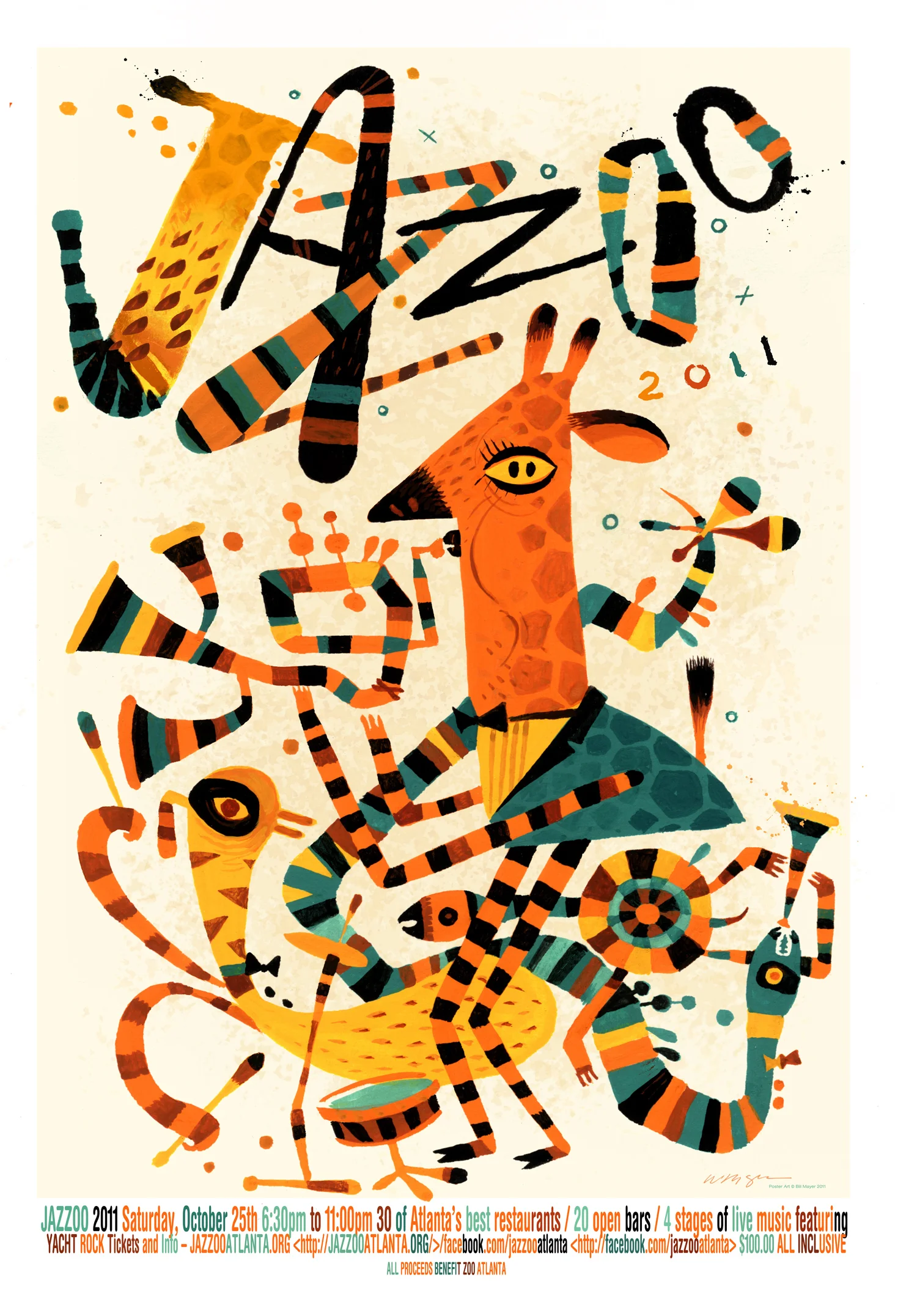
Jazzoo
If it's not apparent, JAZZOO is a fundraising event for the Atlanta Zoo. When I got a call to do this poster, it was pretty much an open canvas. Jeff Stewart, the art director, had gone through my flickr site and pulled off some old samples of "Blind Boys" and other samples of some of the more folk-art styles I had done a few years back. He sent them to me as a possible direction.
I did the normal "bunches of thumbnails" exploration. They were having a lot of trouble understanding the thumbnails so I took a few and added color to make them easier to understand. As an after thought I did a second bunch of fun little folk art versions. Lee liked the folk art ones, but said "they'll never go in that direction..." It's great when clients act unexpectedly, and occasionally, it can make for some fun outcomes.
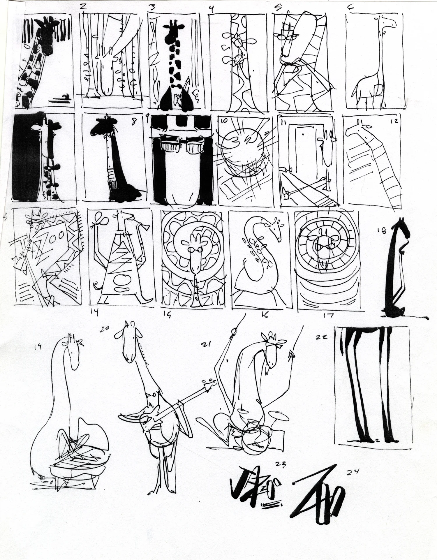
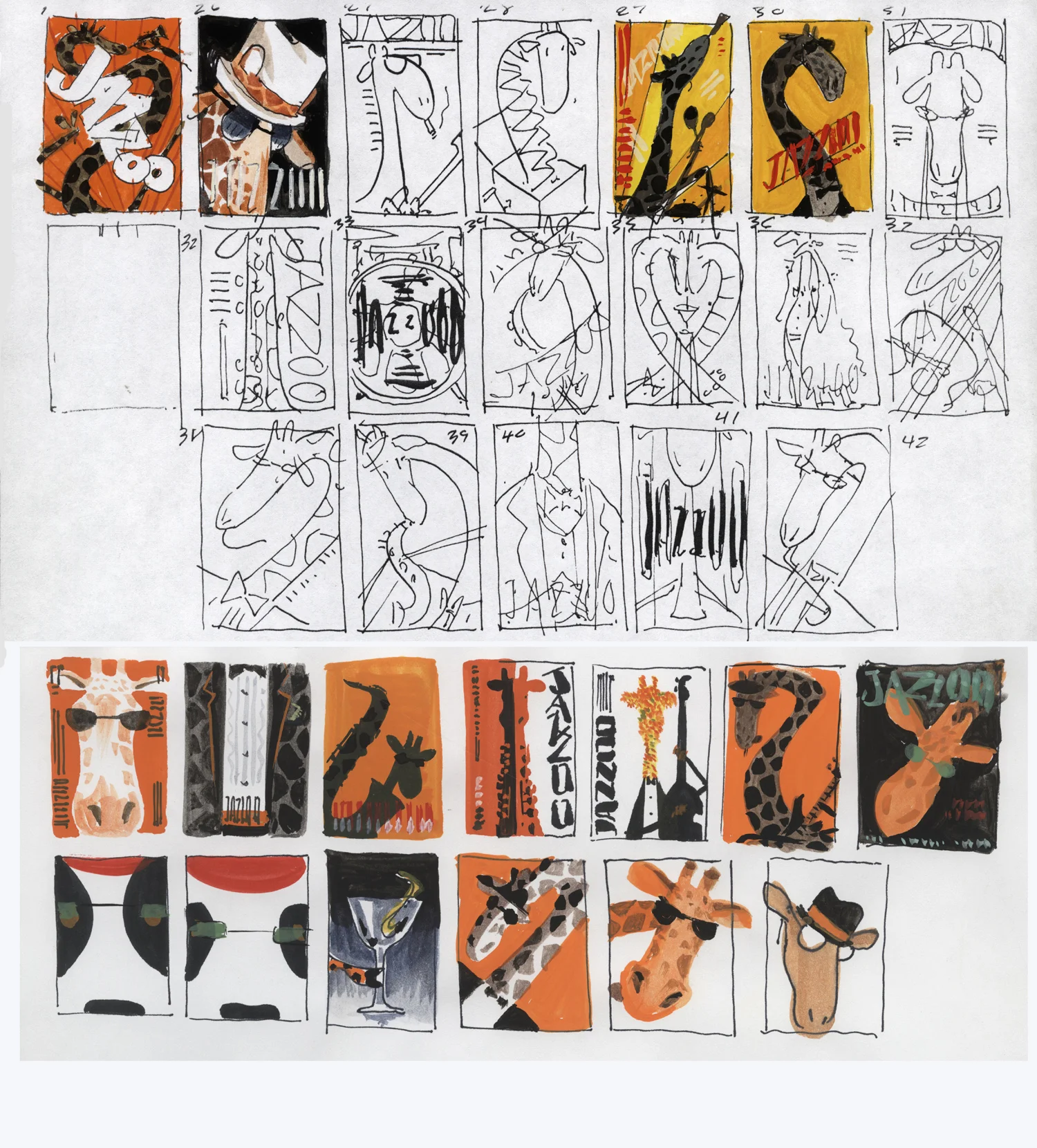

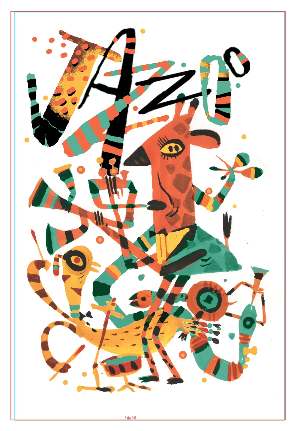
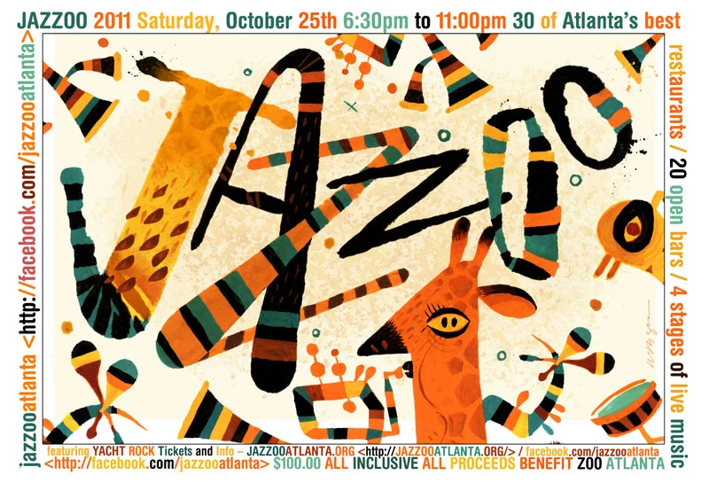
Part of the direction was that the poster had to be of a giraffe. I really didn't think about it much before I started, but that long neck became quite a problem. Tried everything I could think of to work my way around it; hooking it around, over the top, or just cutting it off. I think that is why, when it came to the little folk art versions, I decided to just " Picasso" it and ignore the long neck and move the mouth down and make it into a little face. This worked out better than I had hoped. They loved this direction and their only comment was to make the drawing more colorful. So I took the little thumbnail and comped up a version with the colors close to the way I thought it would work. then printed it out and painted over it on the light box. worked pretty well.
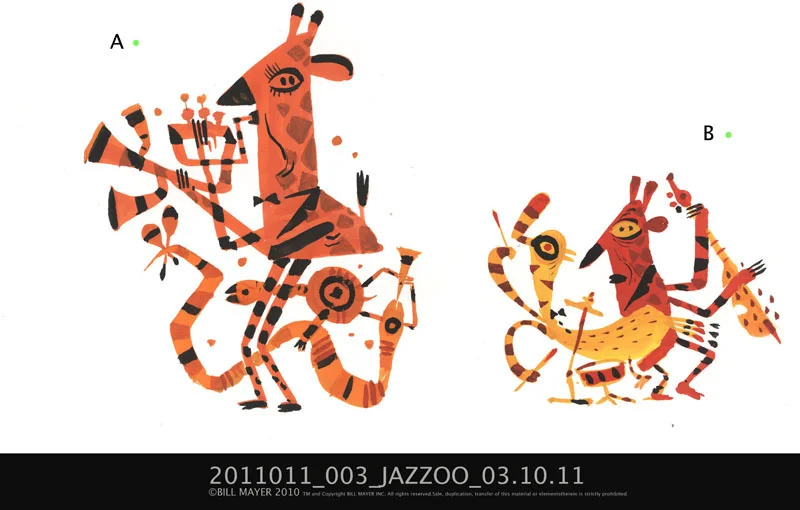
This is the little comp I did, pulling all of the elements from the thumbnails together and organizing them to get a clearer idea of how the drawing would work. Some of the final editing came through after the painting was done to make it read better. opened up the distance in between the characters and the type. I had initially thought about hand doing the other type until they sent me final copy. too much to squeeze into the illustration, Which seemed crowded already, so I put the type at the bottom.This will make it easy to edit as I am sure the copy will change several times before we go to print.
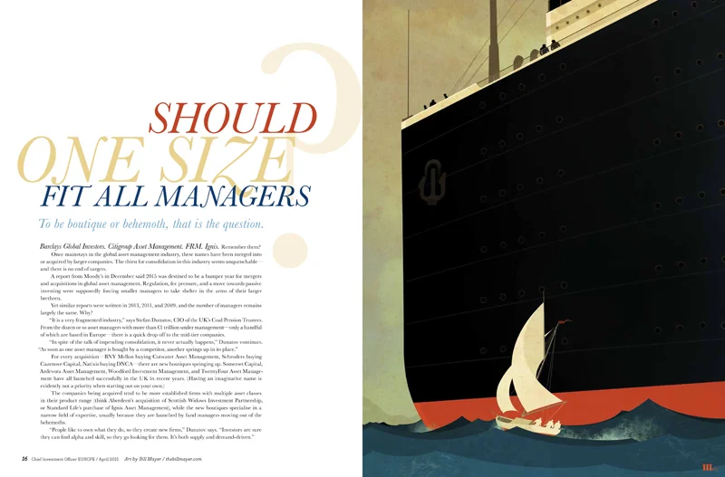
CIO Magazine
I have been playing around lately with some simple digital illustrations, and where better to try one out than on one of the illustrations for the fabulous SooJin. Always so many directions where these things can go... Thumbnailing ideas always one of my favorite thing to do.
From the dozens of ideas, the one clear concept seem to be the "Ships." It was tricky trying to size them without making one look inferior to the other. Showing that both had attributes that work in different ways... Seems like it always falls back to the very first idea...I explored the composition, trying to find the one that felt right. When I got into the final, I decided to make the size between them more exaggerated...


The end result turned out simple, but I thought very elegant.
Always a pleasure working with SooJin Buzelli with one of these illustrations for CIO...
And a beautiful elegant design from SooJin makes it that much better.
Scientific American
Seems like I've been drawing bugs all month. Not really complaining, I loved these projects... This one was for Scientific American. An article about "Scientists dengue-proofing mosquitoes with the help of a pervasive, natural bacterium that can be passed on from one generation to the next."
I did the normal dozen thumbnails. The concept kind of went back to one someone had mentioned in a meeting before it even came to me. Jason threw it out casually. So I always include those options. The plugged up nozzle of the mosquito seemed to be the fastest way to get the idea across so we stuck with it. At first I had thought about a more graphic simple color palette but when it came down to painting it, just felt like it needed more detail.
I loved the idea of putting the mosquito in human clothes... Maybe some nod to blood sucking vampires... but ultimately we decided to blow him up huge. The size would hint at the scale of the problem with dengue. Jason picked number 24 or 26 but since the story was light on copy, wanted to push it to be a spread for more impact. So I did a few sketches of the new layout as a spread.


They picked this one, one more tighter sketch before painting. I painted the background and bug separate because I was really not sure where this was going. When I got into painting it just felt like it needed more detail... We liked him because he felt like a huge beast.. I loved seeing him hunched over sort of sulking...Actually liked the tight cropping, seemed like the size of the bug would get even more exaggerated. And not sure at this point where Jason ended up cropping the image. Can't wait to see this one in the magazine... Going to make such an impact.
Much thanks to Jason Mischka for letting me work on this with him... So much fun.

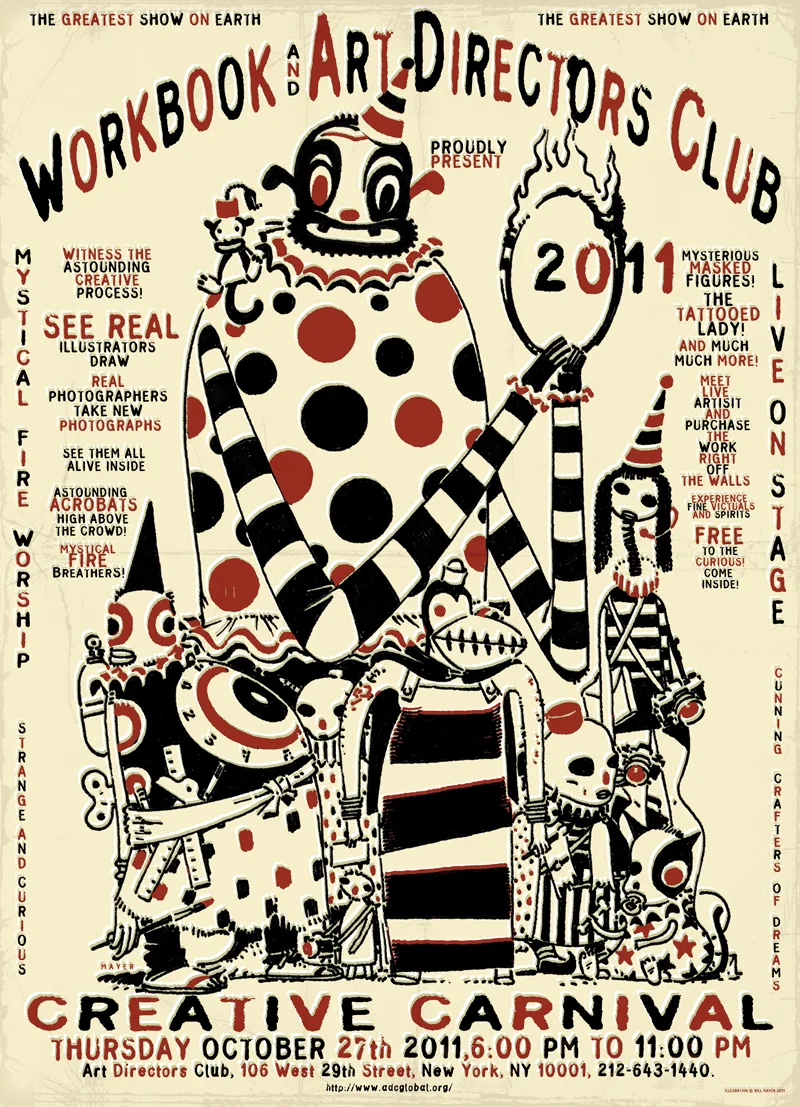
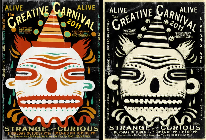
Creative Carnival
Sometimes something just lands in your lap with so much potential. When you have a client that is open for you to do anything you want, and an audience of your peers that will surely thumb their nose at anything sub-standard, you can't help but panic a little at first; right?
This little poster was just so much fun from the very beginning, it was hard to see it all come to an end. Much thanks to all of the folks at Workbook for giving me the freedom to take this wherever it ended up falling. For me, I am much more used to heavy-handed art direction, so this "Do-whatever-you-want" theme I have been getting lately is just such a joy. But also hard to settle down in any one direction. No art director, no writer... Just do whatever you like.... How much fun this would be....

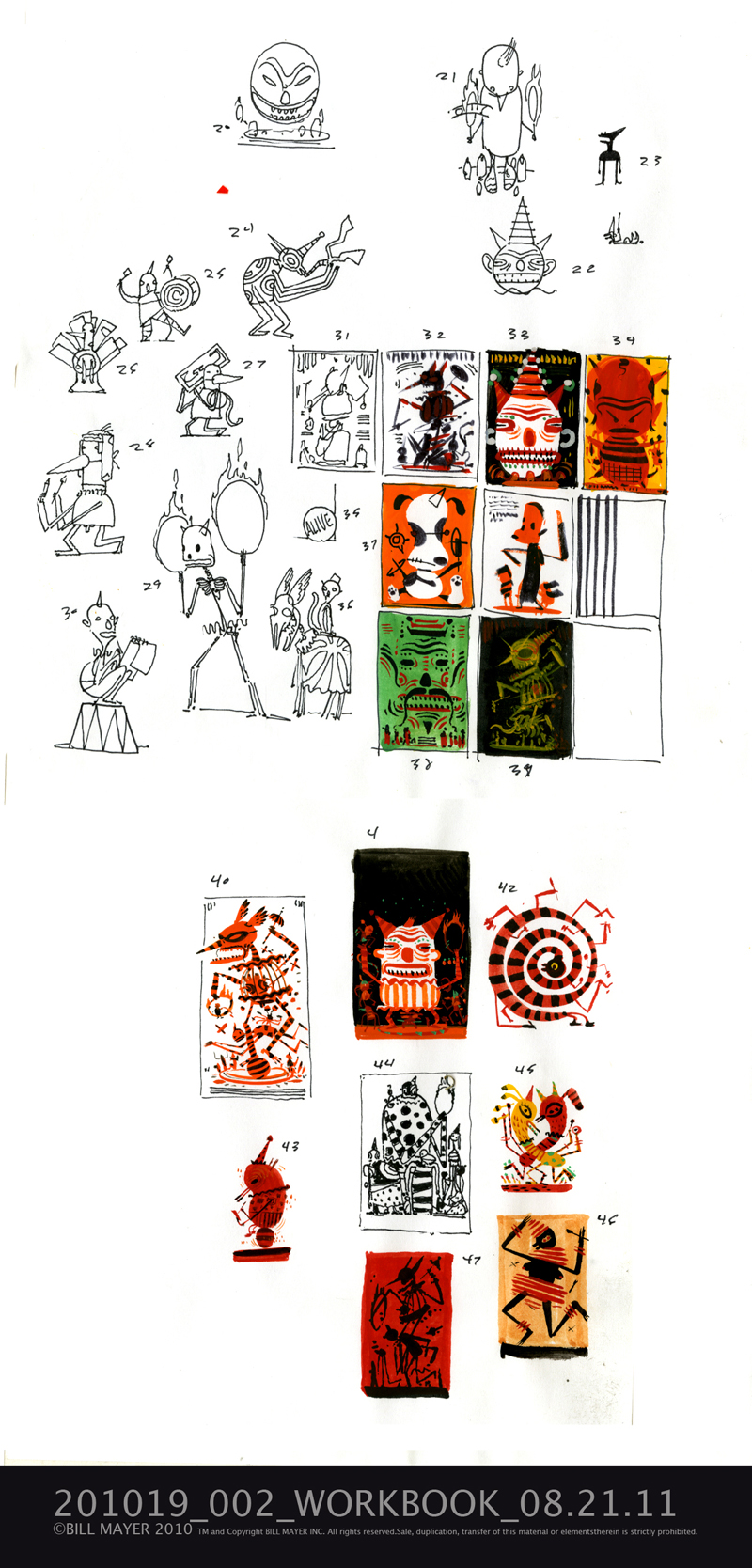
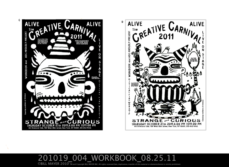


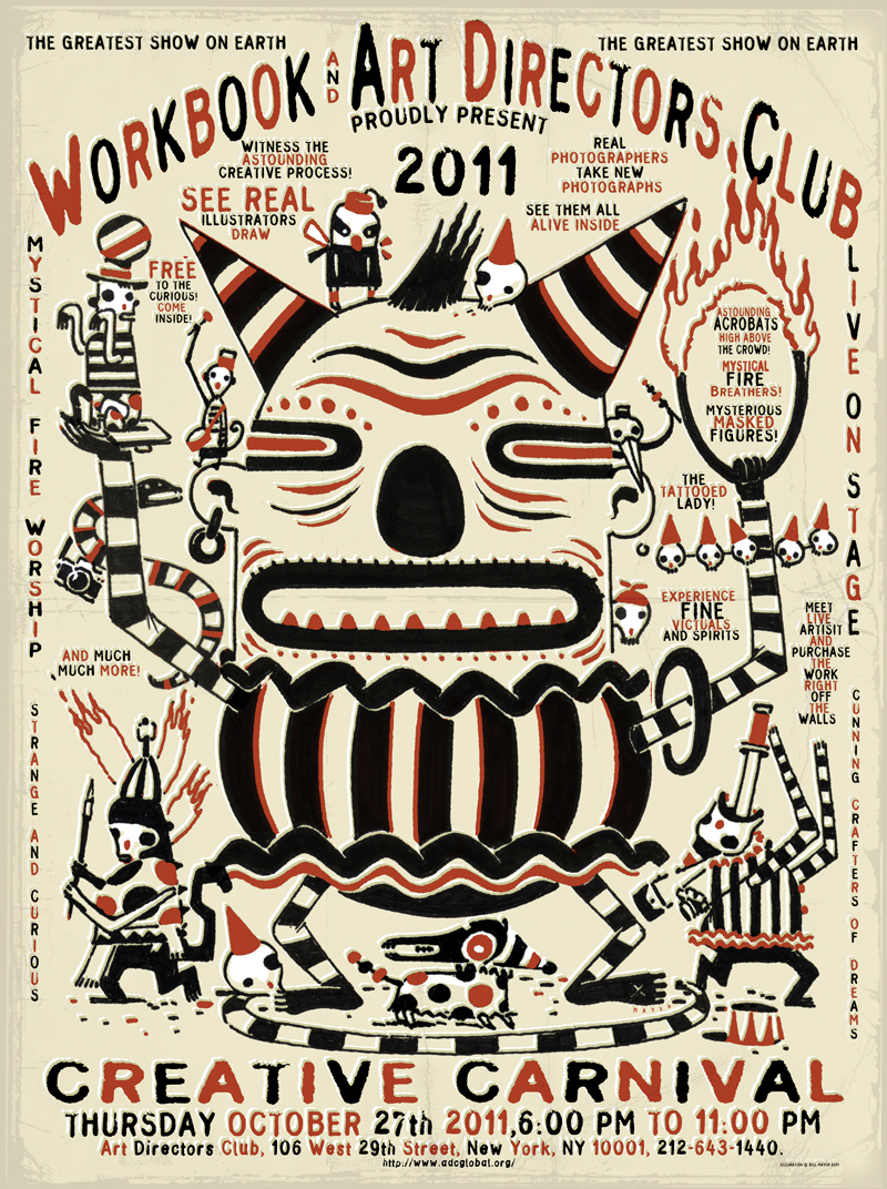

I did the normal thumbnail blast of overthinking directions and came up with four ideas that I thought worked pretty well. So, I comped those up and shared them with Alison. She warned me not to show so many ideas; that although they will enjoy seeing the process, they will not understand them and probably take me off in a direction I really don't want to go in. So we talked about them, and she said, "Do what ever you want...."
This is still so hard for me, making decisions on what or where to go with a project so I decided to keep working on them and flush them out and sooner or later one would emerge as the right direction. I took the candidates and ran them by my normal group of internal critics and they like three, which I took a little farther toward the final poster. I wrote some copy and put together some type to give it that Carny feel...finally the two that were working both worked so well I figured either one would make a great poster so Sent them off to the "Reply all" group for feedback. They were split on which one to go with but now offered some input (yes, of course, never too late for changes) on copy. Adding the performers and free drinks and victuals...( I had to look up victuals...)
I always loved Carney's, the dark, sort-of seedy side of those traveling freak shows and circuses that we were exposed to early in life. We had a traveling fair that would come through our town every year. I remember those so vividly. There was a great little movie version of a Ray Bradbury story, taken from a line in Shakespeare..."Something Wicked This Way Comes" This was a perfect visual inspiration for the feeling of those old Carneys that I remembered. When we were in art school at Ringling, there were lots of old circus performers that lived in the Sarasota area. It was not uncommon to pass them sitting on the porch of an old boarding house... a dwarf and a fat lady, just sitting, enjoying the day.
This stuff has so much great texture. Lee and I collected Victorian taxidermy animal freaks for a while. You know Chickens being ridden by squirrels with a little whip... Vampire mice with little capes, animated birds.... There is a great little shop, I think it was called Shoefer's on 31st between 6th and 7th Avenue in New York... where we found a standing goat who's penis flies out when you pull his tail. Yeah I know silly stuff to lay around the house, but fits right in with our gypsy junk. Shoefer's is a glass eye sales and taxidermy rentals, bizarre little place that we frequented to buy strange and mostly damaged dead things out of the basement.