
Photo Credit: Alfred Barnard

Another great opportunity to anthropomorphize a Berkshire pig in a collaborative project for Orphan Barrel. J P Elliot at JKR gave me a heads up they wanted to do a series of three Scotch labels for successive 24-, 25-, and 26 year old scotch whiskys. But first they just wanted to start on one. I started with a little research on antique packaging and old advertising to try to get the right feeling. I looked at cigar labels and patent medicine bottles for inspiration.
The name we started with was “Butchers Block,” so some some of the original designs had a different feel about them. When they changed the name to Muckety Muck everything started to fall into place.
A Muckety Muck is a person of great importance or self importance. It made sense to have the three labels be generational thing. The first one being the young statesman-like son. The other two which I'd do a year later would be the father and the grand patron... the grandfather.
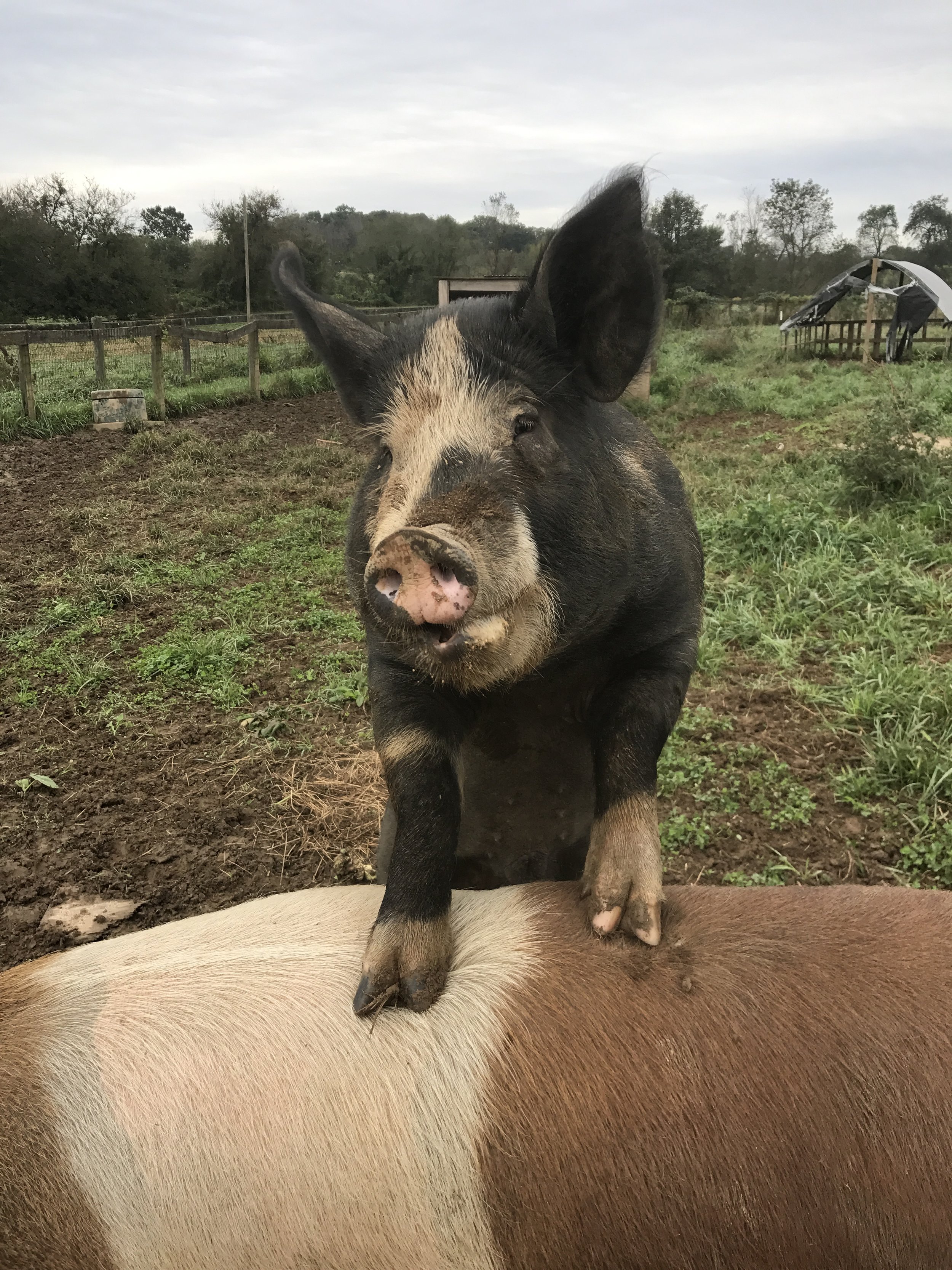
There's a farm in Canada near the cottage, Maple Ridge Farm north of Kingston Ontario. Where we went with the boys Zak and Dash and visited my model for the Animal Farm series' Napoleon. A Berkshire boar named Turbo. A huge, imposing pig, living with his favorite sows and dozens of little piglet children. Lots of great Berkshire reference....

Turbo
Pork Chop (One of Turbo’s many children)
The whisky was recovered from the famous Port Dundas Distillery, so naturally the Scottish wardrobe made perfect sense. We found some old engravings of the building and the huge smoke stacks made it so recognizable. After researching Port Dundas some more I got some ideas for this setting on the docks with old historical buildings in the background. This seemed like a believable way to stage the portrait.


I did several passes on the lettering in a rough form but they decided to bring in a specialist Jason Carne who does the most brilliant hand-lettered vintage type. So glad they brought him on board . We worked close with the art director JP Eliot and the results were nothing short of brilliant.

Could not have been happier with the results. When they called a few months later and wanted to start on the second and third labels I was utterly delighted. It was great to pick up on these delightful pigs and bring the family to life. Each of the family I decided should not only be older but the clothing should also be more elaborate, elaborate to the humorous side of extreme.
they wanted to add a barrel into the composition as a place holder for the 26-year old version. I worked around that by having the grand patron seated, the other two flanking him in a jolly toast to the new year. Some holiday lights in the background also help with the festive mood.
I had lobbied for one character on each label because of the small size and the amount of information they needed in it, but they had a vision, and looking back it certainly does set the labels apart.


Much thanks to all of the folks who worked on the project,
To JP Elliot art director extraordinaire, and to Jason Carne, whose fabulous lettering just made the label a vintage advertising dream come alive.